Custom Printed Rolling Papers - RGB vs CMYK: The Difference in A Nutshell.
Getting into media designing and process printing? Then you might have heard of RGB and CMYK color modes. Knowing the difference between the two will help you optimize your design process, starting from the design to printout.
RGB vs CMYK. What’s the difference?
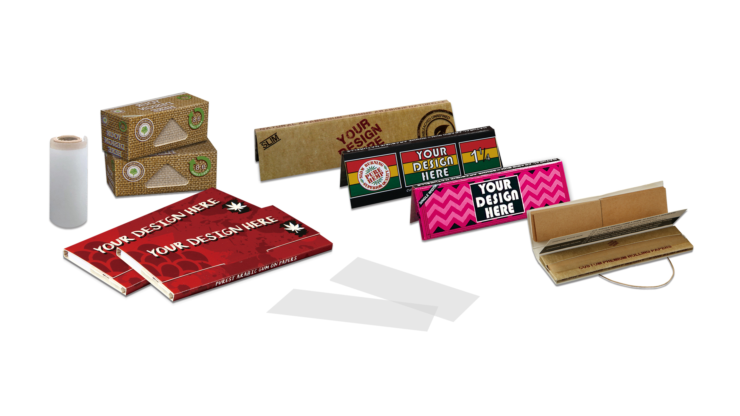
Here is a scenario. You decided to make your own brand of Custom Booklet Rolling Paper for your first ever herb event. You filled the design with colorful lines and curves with your logo branding on it. You looked at it and knew it’s perfect - so you decided to print it. To your surprise, the final artwork print came out washed out and is not even close to what you have actually designed. Maybe the printer was low on ink? Or maybe you missed a setting in the printer?
The answer lies within the color modes used when you designed the Custom Booklet Rolling Paper or Custom Printed Rolling Paper. Computer screens use RGB to show the color of the images, while printing machines use CMYK. The acronym makes it sound complicated but to put it simply, RGB and CMYK are just colors.
RGB stands for Red, Green, and Blue. Imagine your computer or your TV having hundreds of thousands of tiny lightbulbs in its screen. Each lightbulb in the screen can project any color by mixing RGB and by varying its intensity. Combining all the lightbulbs will then form an image in your screen. RGB color mode is best used for digital work like icons, logos, desktop wallpapers, and etc. RGB color mode is intended for screen displays.
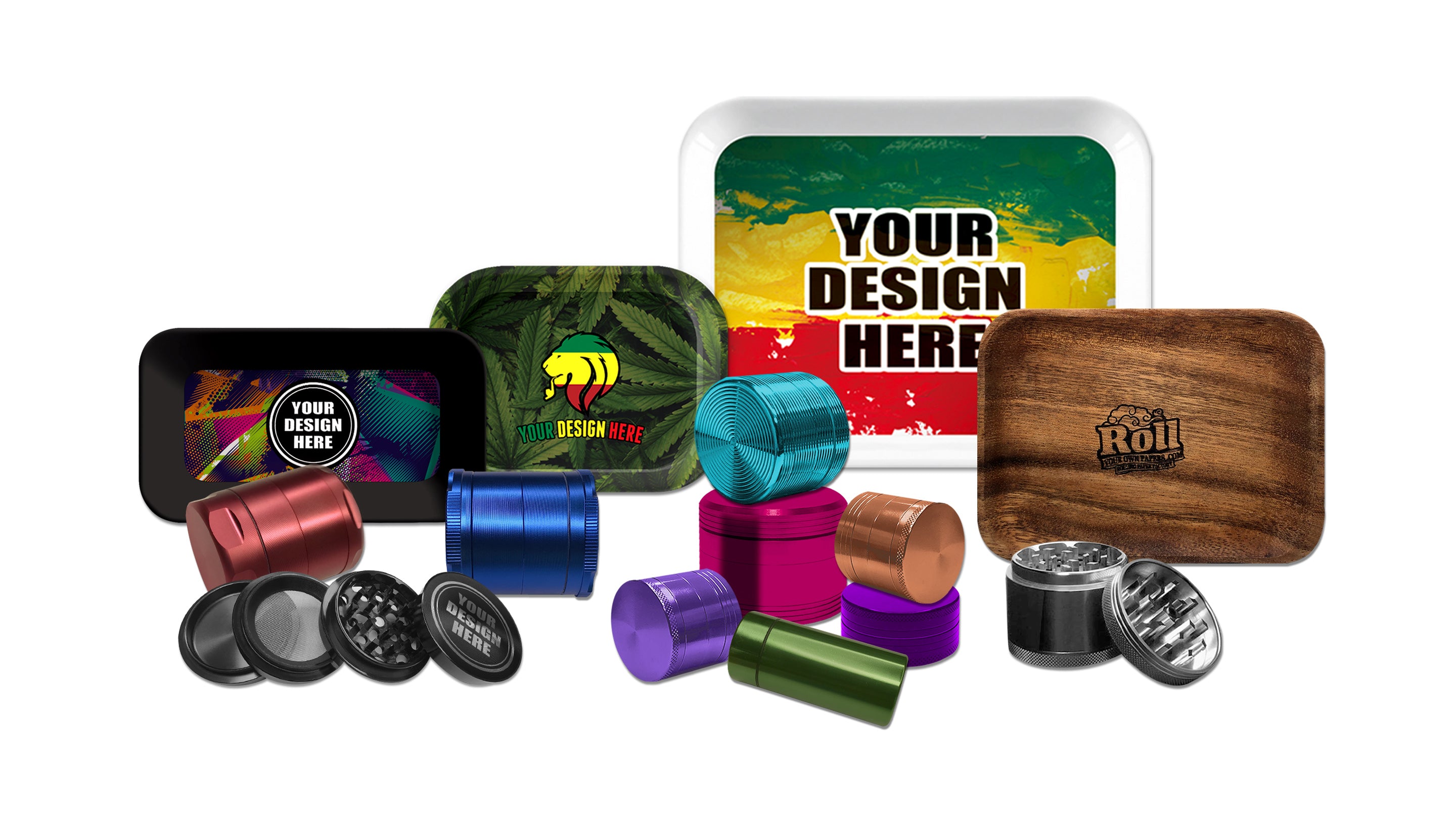
CMYK, on the other hand, stands for Cyan, Magenta, Yellow, and Key (Black). Unlike computers or TVs, printing machines don’t use light source to create colors. It uses physical ink to create the image. Printers combine CMYK colors to create different color or shade. CMYK must be used for any project that needs to be physically printed like custom booklet rolling paper, rolling trays, custom printed papers and the likes. When designing, it is best to use CMYK color mode to get more accurate result when you print it.

What you see on screen:

How it will look like in print:

How to convert from RGB to CMYK?
When designing, one of the biggest mistakes you could make is forgetting to use the right color mode for your project. If you forget to do this, colors could appear washed out or too vibrant.
Here is how to convert from RGB to CMYK in Adobe:
In Photoshop, go to Image > Mode > CMYK Color
In Illustrator, go to File > Document Color Mode > CMYK Color
What if you need to use both RGB and CMYK on the same image? Let’s say, you need to print an image but at the same time upload it in a website. What would be the best approach?
It is recommended to design using CMYK color mode first. Simply because, RGB supports a wider range of colors than CMYK and would give you a closer match in colors.
Final Thoughts
Knowing the correct color mode to use in your project would help you save time and effort when designing. It will also make your design look as intended, whether you use it on a website or in print.







Recently, I’ve been having some trouble on my artwork printouts mainly because of its color. Whenever I print it out, the color would be either faint or dull. As I was searching for a solution for the given matter, I happen to see your blog. I must say, this has been of great help for me, it is very informative.
Leave a comment